Logo itself is actually in the middle, it looks off because it’s not perfectly square.

fucking lol
rofl
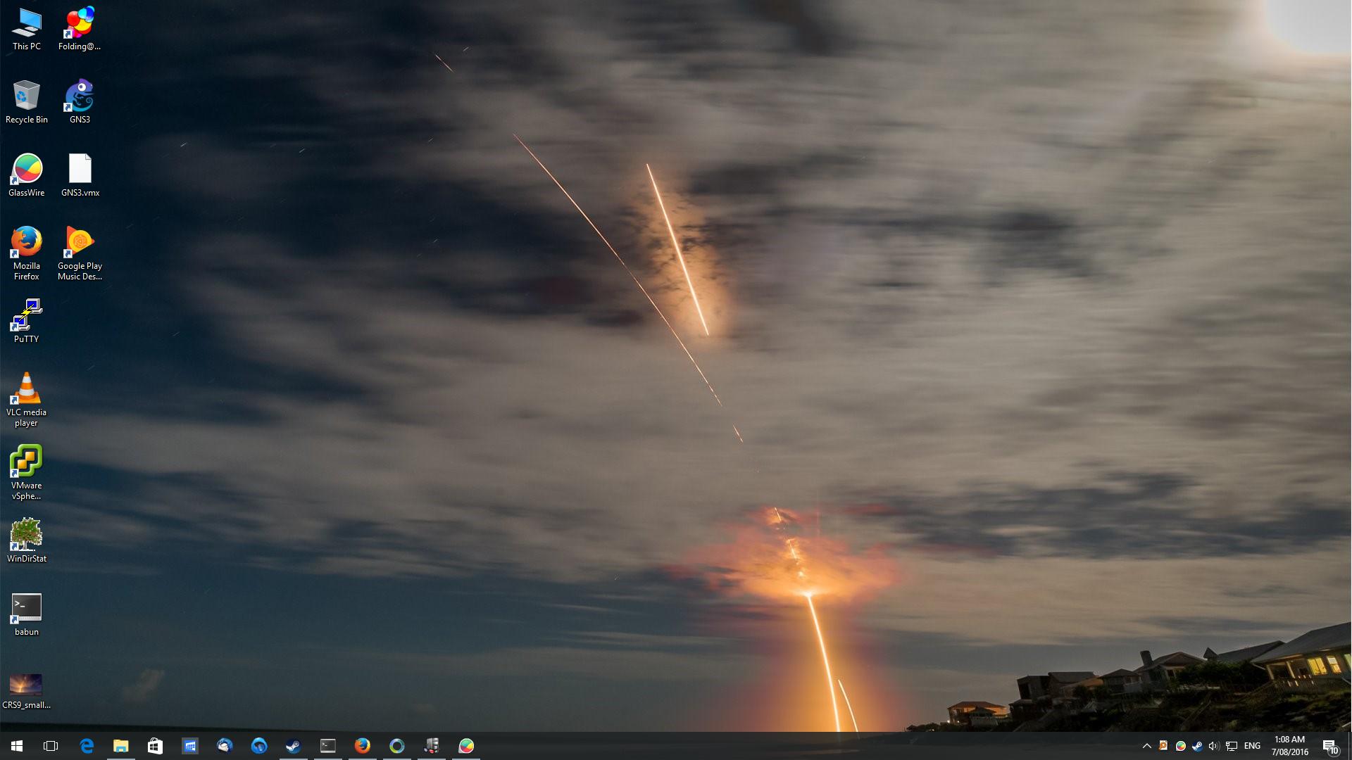
Is this from star trek? Where they destroy vulcan.
It was SpaceX’s recent launch/landing of Falcon 9, long exposure.
It looks epic :o
You have quite a weird date format.
Why? It’s hh:mm year-month-day.
No, the way it’s written with dots and spaces.
I think any computer I ever used had that.
Mint 18 Cinnamon with the Pulp/paper theme Material Design Suite "Paper" Offers Theme and Icons for Ubuntu/Linux Mint - NoobsLab | Eye on Digital World
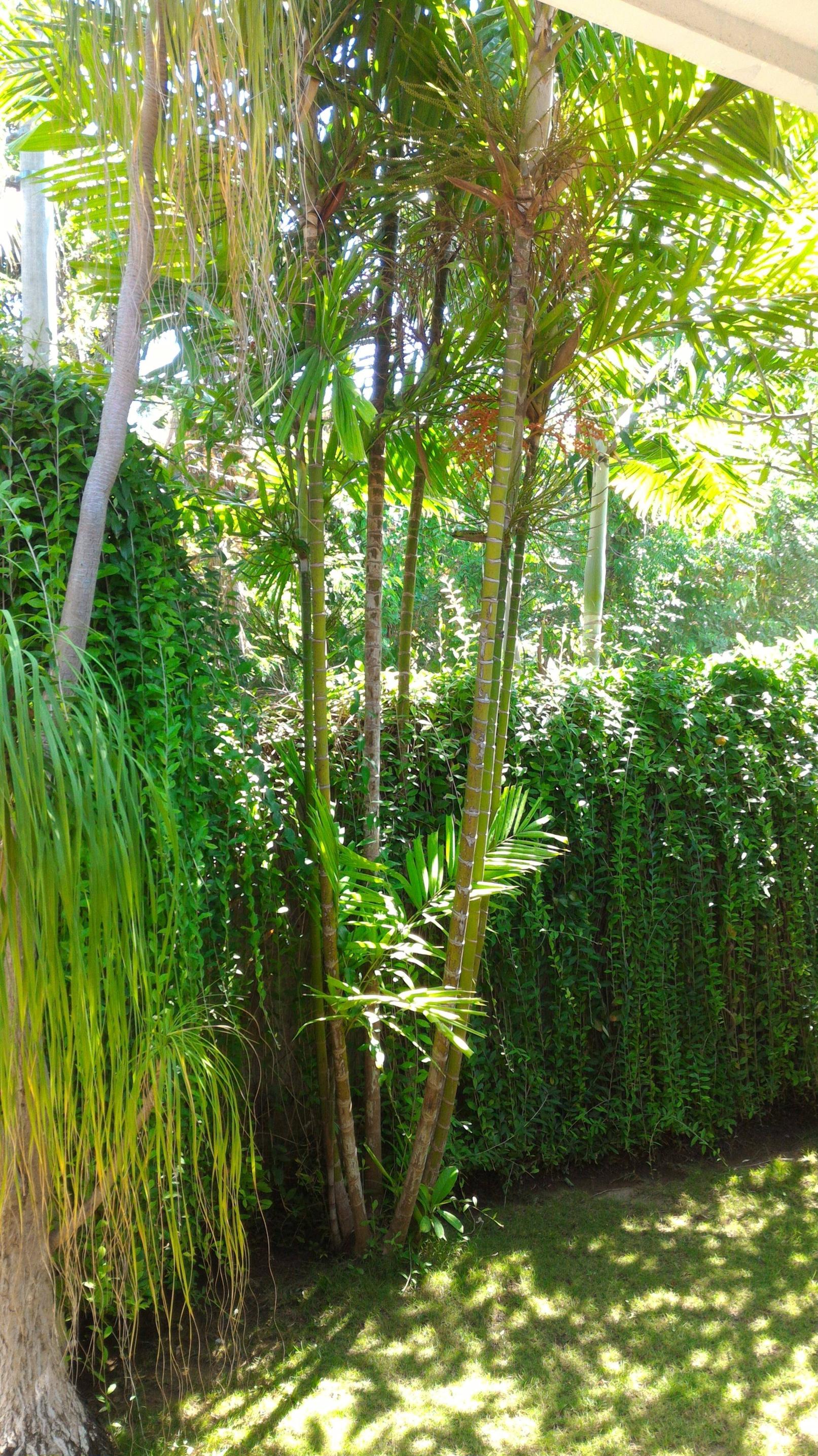
and an OC background of a red palm fruiting in my front yard after some rain (happens every month).
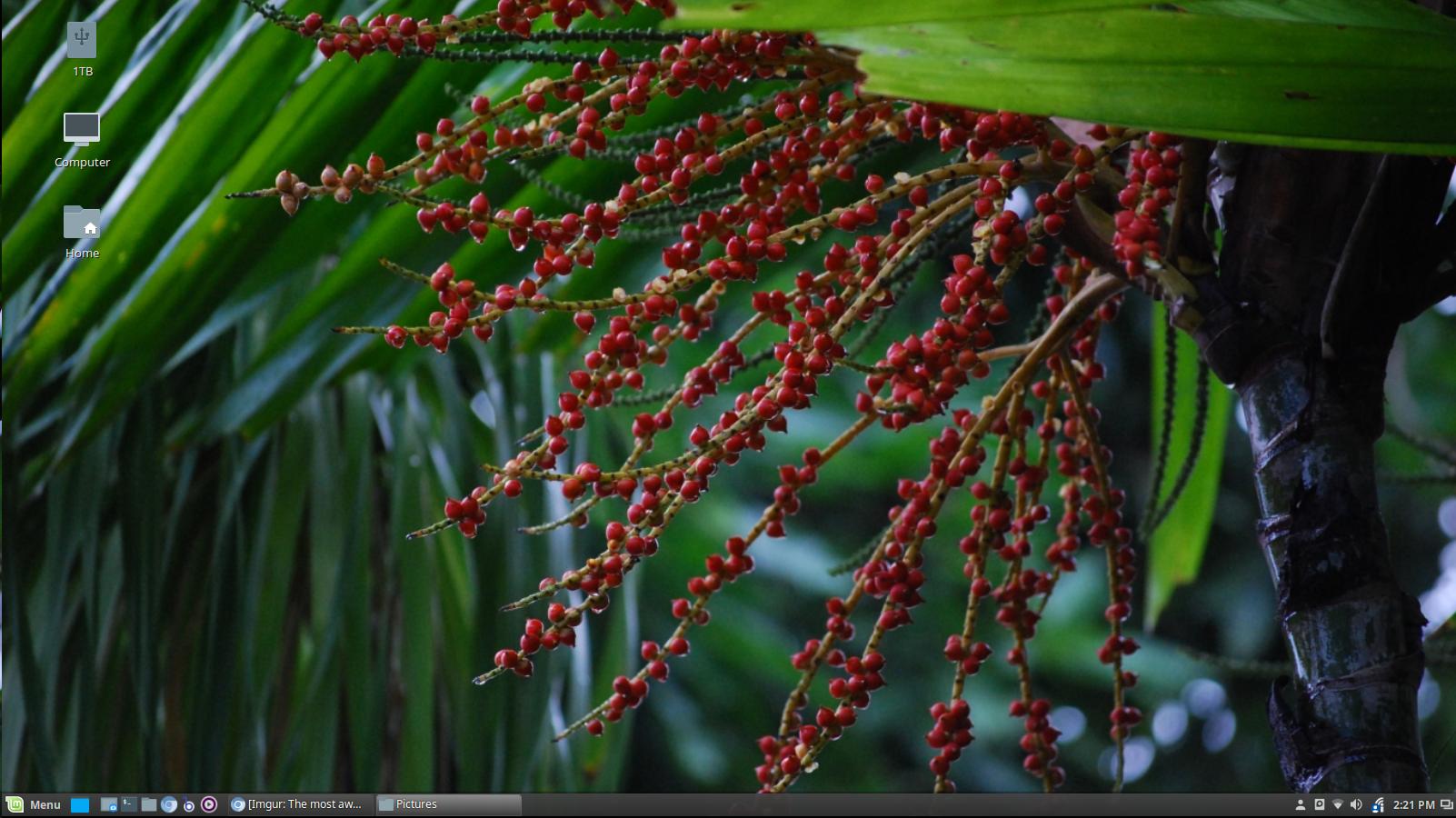
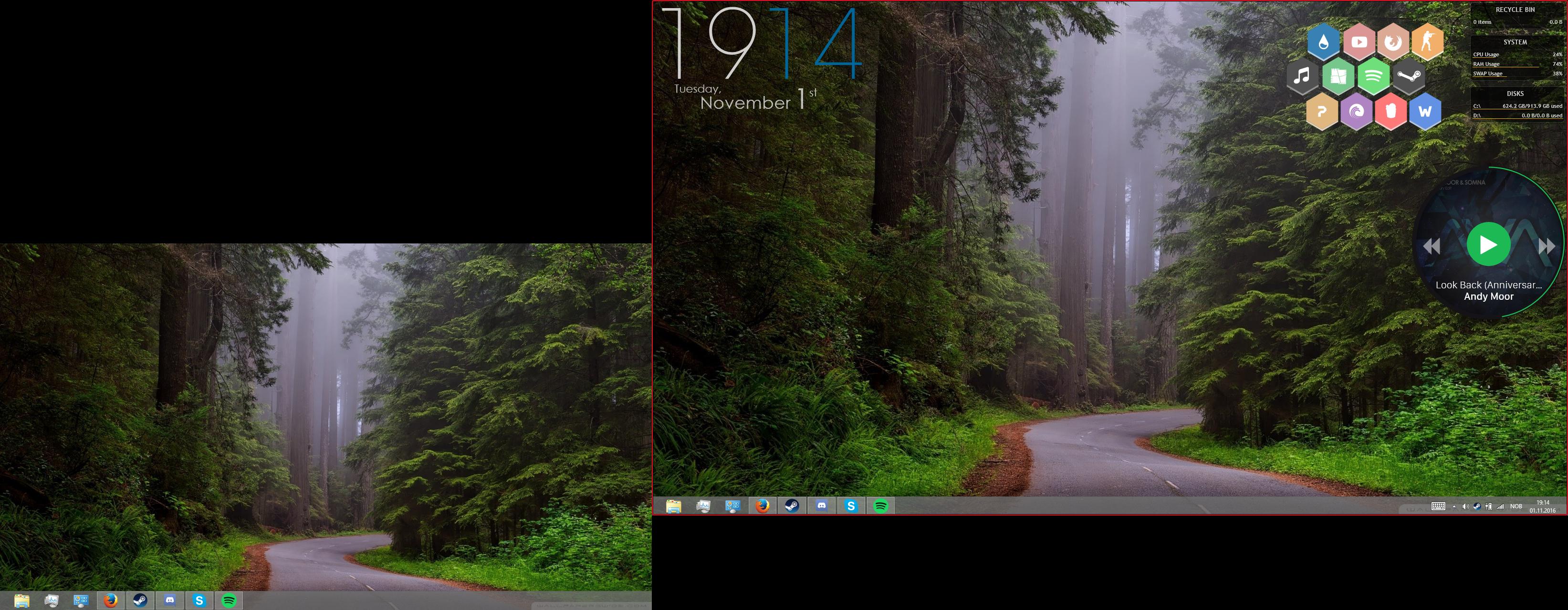
All 3 monitors, it looks bad when scaled across monitors so I just tiled it.
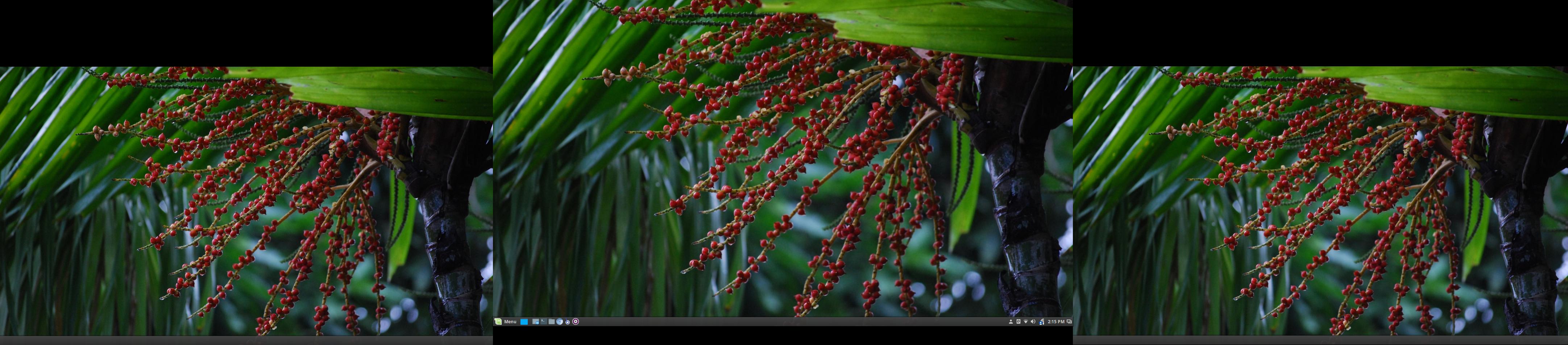
wow, can you post a picture about the full tree? That looks amazing.